The Mission
This limited-edition serum presented a fast-moving opportunity to make a bold impact — a chance to design something visually striking and treatment-focused that could instantly elevate the brand’s visibility in the market.
Unlike standard P&G workflows, this project demanded agility and creative decisiveness — from concept to execution, everything had to move at speed without compromising on impact or quality.
Unlike standard P&G workflows, this project demanded agility and creative decisiveness — from concept to execution, everything had to move at speed without compromising on impact or quality.
The Challenge
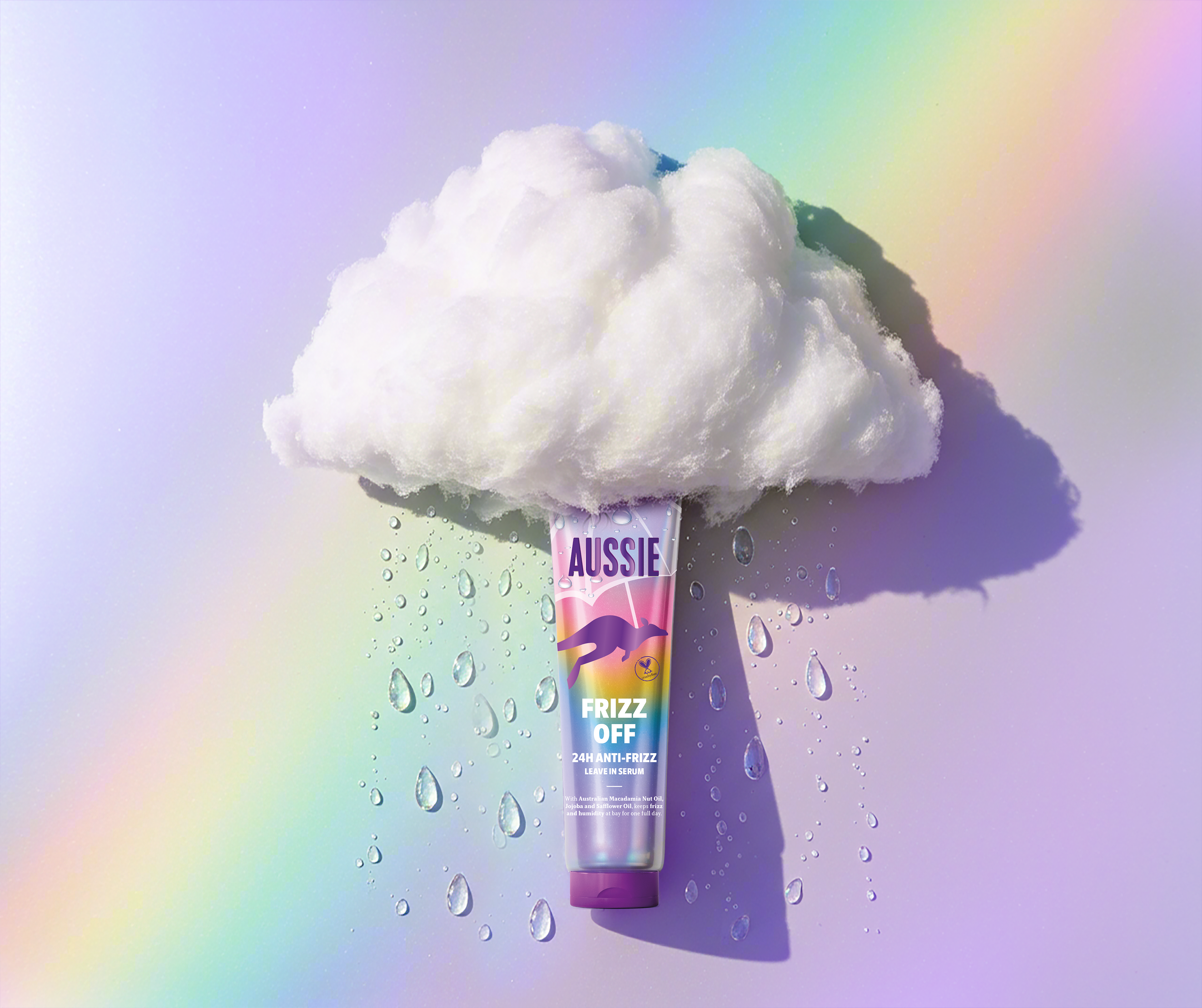
The challenge lay in uncovering the right story — one that could connect the product’s essence with the spirit of the brand. Inspiration came from the timing of the launch, at the end of October, and the ever-changing UK weather, Aussie’s home market.
From this, a narrative began to take shape: the leap of hope after every storm — the moment when the clouds part and a rainbow appears. This became the creative thread linking emotion and benefit: hair that stays smooth and radiant, even when the weather turns wild.
From this, a narrative began to take shape: the leap of hope after every storm — the moment when the clouds part and a rainbow appears. This became the creative thread linking emotion and benefit: hair that stays smooth and radiant, even when the weather turns wild.
My role
Creative direction, packaging design, visual identity development, print trial supervision, and project management.
The outcome
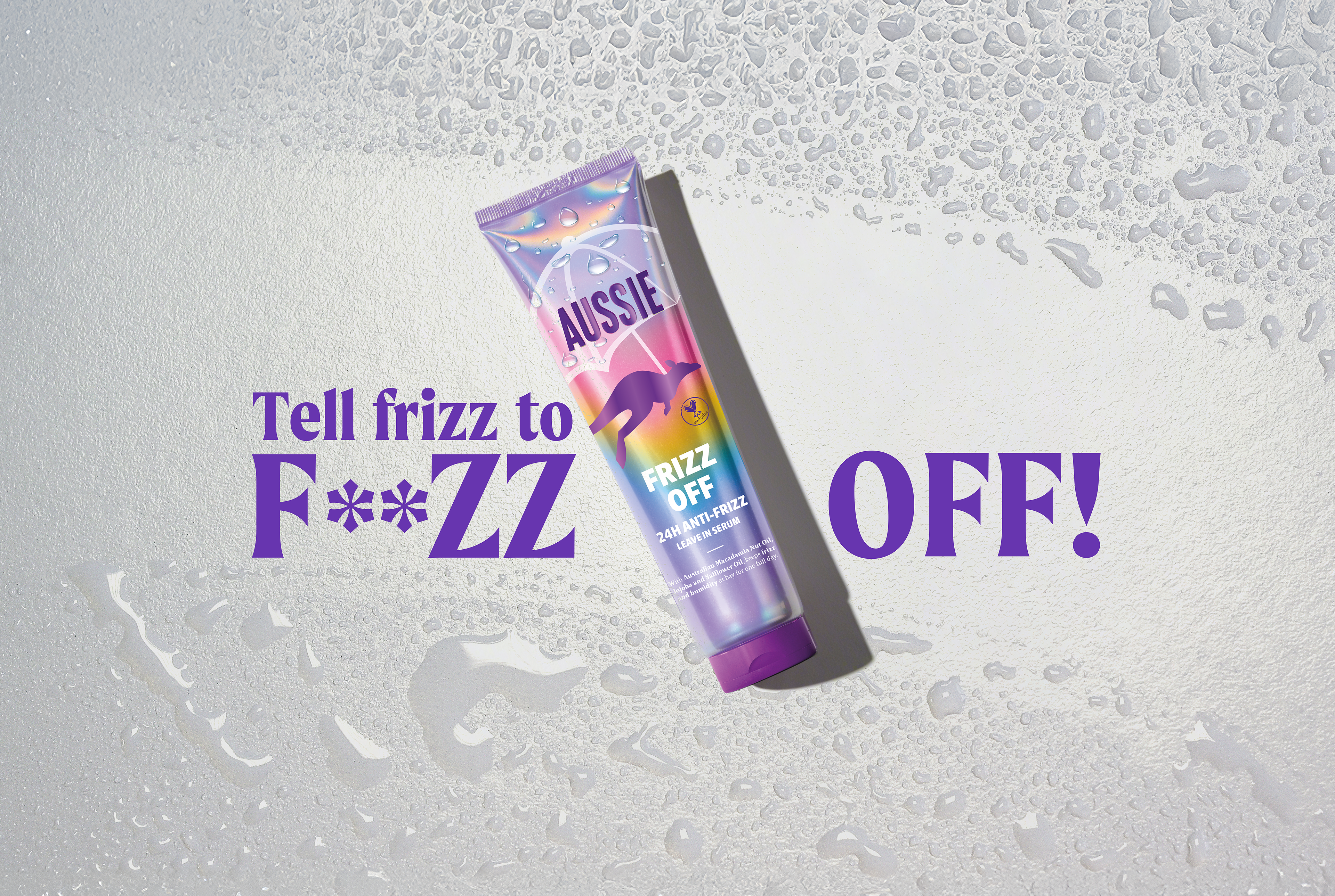
The result was a dazzling, conversation-starting product that delighted both loyal fans and new customers alike. Playful and eye-catching, the packaging captured the brand’s joyful spirit while housing a truly remarkable formula. Launched in the heart of a rainy autumn, it brought a burst of color and positivity — a little rainbow moment that people couldn’t stop talking about.