The challenge
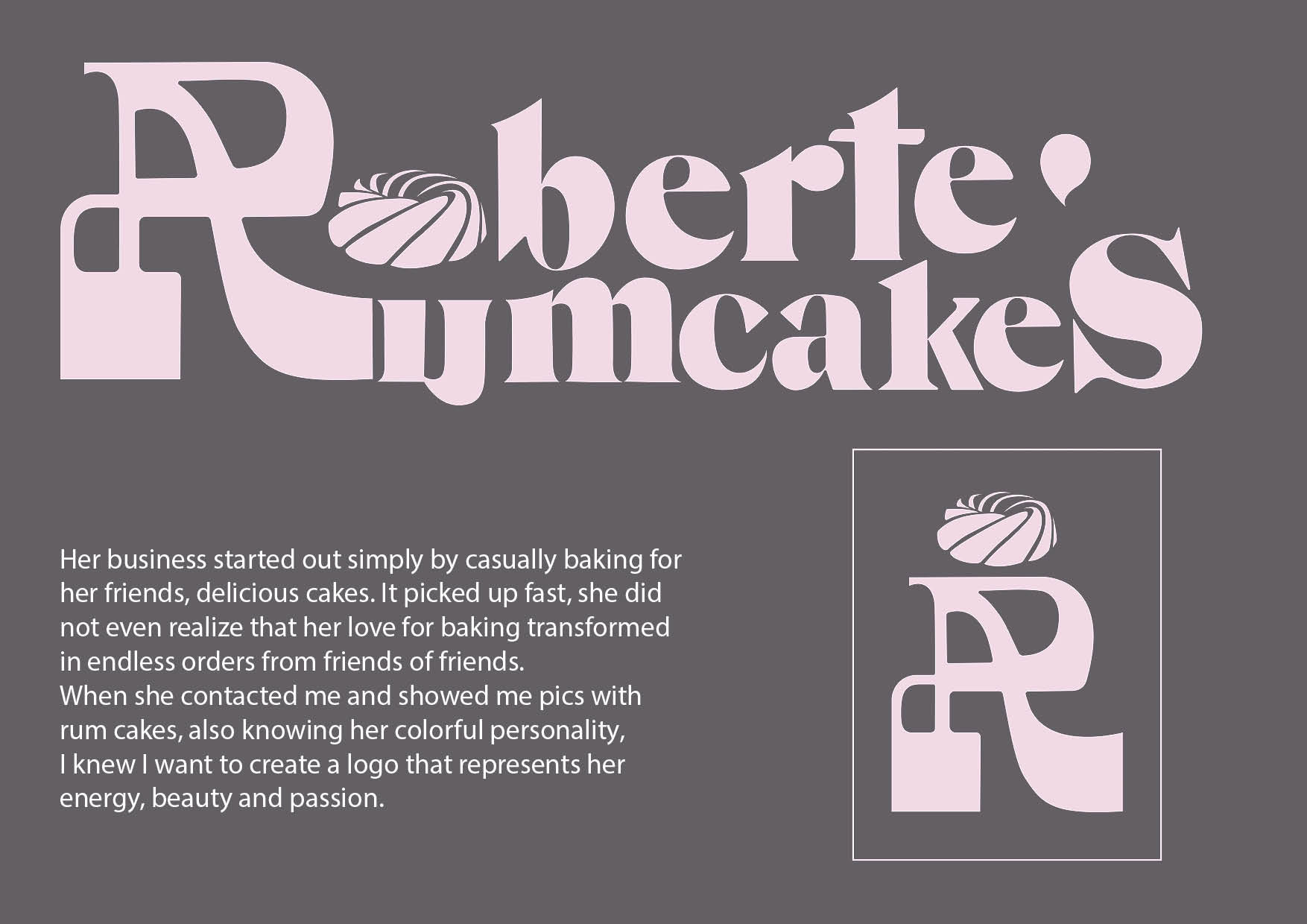
Roberte is an amazing woman, with lots of talents, and one of them is baking. Her business started out by casually baking delicious rum cakes for her family and friends. It picked up fast, sooner than she knew orders were coming, with no intention of making a business out of this. When she contacted me and showed me what she bakes and told her story, I knew it is going to be fun to design her logo.
The outcome
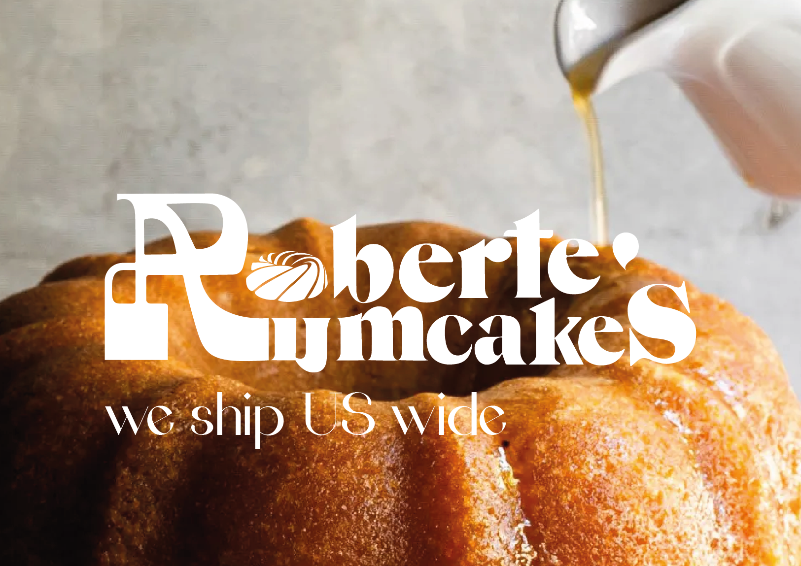
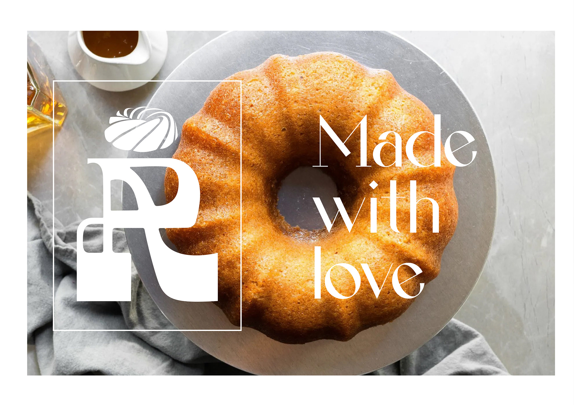
Inspired by her personality, shy at first glance but so bold once you get to know her, I designed the first letter. It is an R that also looks like an A, the first letter in the alphabet. The specialR becomes the symbol of her name, and the hidden but obvious A is the quality of her cakes. The logo’s body is inspired from one of the typefaces created by “Quchi que tipo”, is simply fitting with the colorful Roberte’s energy, Roberte’s Rum Cakes.